Introducing Our New Brand
New look. Same commitment.
24 January 2024
In honour of our 20th anniversary this November, we’re celebrating the occasion with a new brand identity. With a fresher, friendlier look, we’ve reinvented our corporate image to reflect our growth over the last two decades and double down on the core beliefs that make us a good partner.
Since we opened our doors in 2004, we’ve grown from a small repair centre to a supply chain solutions provider by simply saying “yes.” Our last 20 years have been characterised by a people-first culture where we strive to support our partners at every step of the supply chain from repairs and inventory management to logistics, distribution, development, and manufacturing.
Combining a contemporary design with soft, playful elements, our new brand identity evolves our image in keeping with this business development but honours the core principles that have shaped our working culture over the last 20 years. Embodying our values of collaboration, flexibility, technical competency, and simplicity, our new identity renews our commitment to go above and beyond for others and be the helpful, friendly partner you can rely on.
Keep scrolling to learn more about the brand elements we’ve changed and why.
01. Brand Values and Personality
Born as a family business, our core values and personality are what set us apart. We decided to bring these to the fore of our new brand, prompting us to put our values and personality into words at the start of the creative process.
Values
People first: Our partners and team sit at the heart of everything we do, and we exist to help others succeed. We pride ourselves on creating bespoke solutions that suit the individual requirements of our partners and add value to their business.
Collaboration We forge partnerships, not relationships. We work together with our partners towards shared goals, and work hard to foster a community spirit where everyone feels part of the Microtek family.
Flexibility: We operate autonomously to provide flexible solutions that easily fit into existing processes. We adapt alongside emerging industry trends and requirements, and are always on hand to offer support to our partners – whenever they need it.
Competency: We leverage our collective knowledge, technical and industry experience to deliver reliable, high standard solutions. We prioritise quality over quantity, and never commit to anything we cannot deliver.
Simplicity: We don’t overcomplicate things. We provide simple solutions for our partners to streamline operations, improving the customer experience and reducing time spent of low-priority matters.
Personality
Our personality is professional but personable.
Warm: “Having or showing enthusiasm, affection, or kindness.”
Jovial: “Cheerful and friendly.”
Helpful: “Giving and ready to give help.”
Dedicated: “Devoted to a task or purpose.”
Practical: “Likely to succeed or be effective in real circumstances.”
Conscientious: “Wishing to do one’s work or duty well and thoroughly.”
02. Logo
Sleek, fluid, varied.
Our new logo presents a clean, minimalist approach to logo design with its simple horizontal format combining brand mark, brand name, and strapline.
The abstract nature of the brand mark creates playful movement in the overall logo with its soft curves and fluidity, symbolising our adaptable nature. Its multiple shapes and gradient colours work together in harmony to visually represent our community spirit and diversity in service provision.
03. Strapline
"endless epossibilities"
Our business has continued to grow and evolve over the last 20 years. Our new strapline reflects this journey and our expansion of core services from repair solutions to 3PL logistics, distribution, software and hardware development, and manufacturing.
04. Typography
Our typography consists of two sans serif fonts for a contemporary feel.
Logo: Varela Round
Core: Nunito Sans
We chose a soft, rounded typeface for our logo to reflect our adaptability and warm, approachable nature. A crisp, well-balanced font was then selected as our core typeface for simplicity and clarity.
05. Colour Palette
Fresh, friendly, timeless.
Taking the hero navy of our old brand, our new identity extends this timeless classic into a palette of fresher, more vibrant blues and greens.
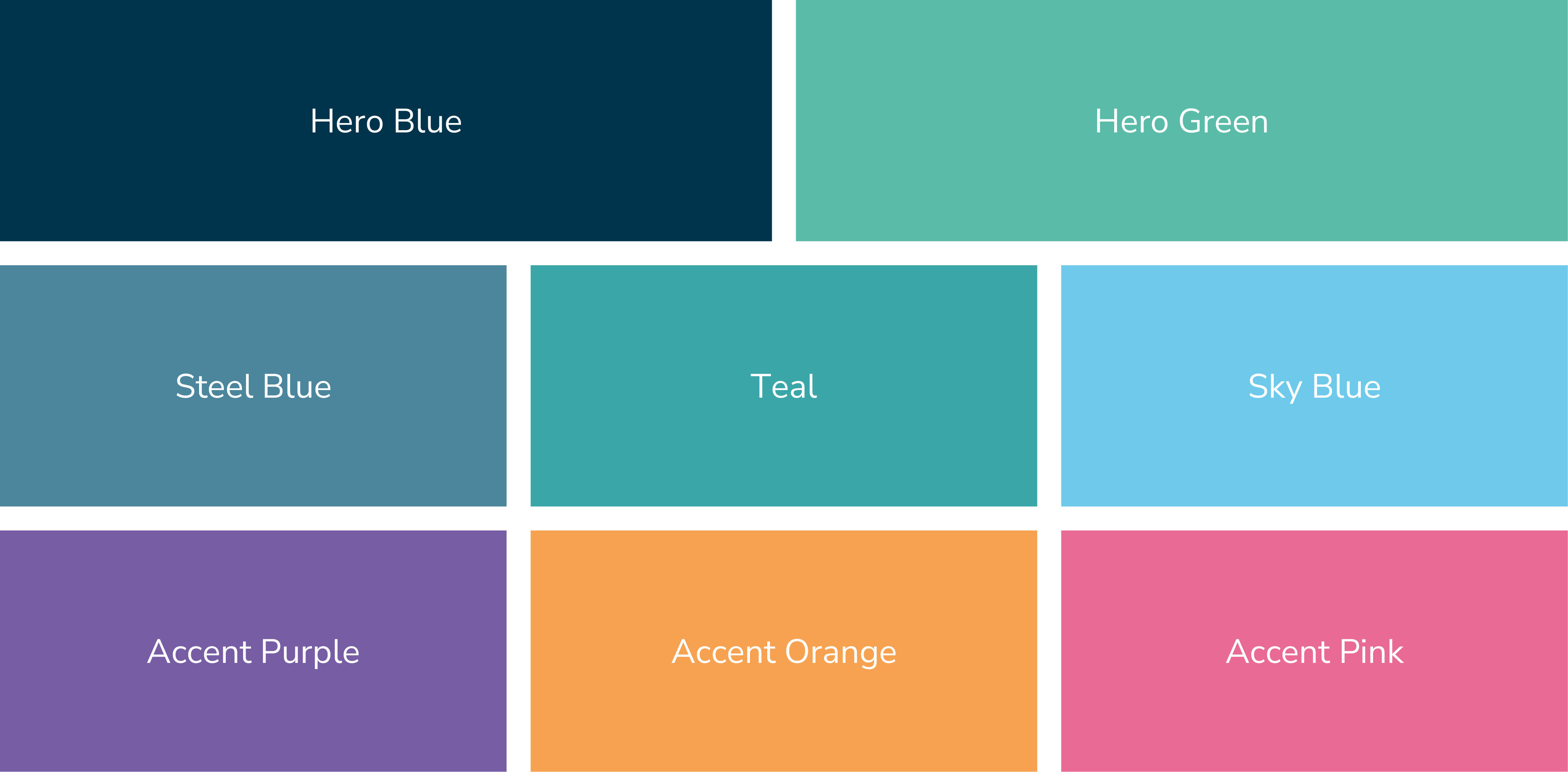
Three accent colours add a touch of playful colour whilst a neutral palette provides necessary contrast in design environments.